
The key colours for this particular palette are Xereus Purple and Dark Flesh (VMC). Broadly speaking the purple is used in the shadows and the Dark Flesh, in reality a shade of yellow, in the highlights. This is a high contrast colour combination and hopefully I’ve avoided the extremes and managed to achieve an energetic, but not violent, level of contrast.
Uncle John’s costume and parrot are painted with the primary colours red, yellow and blue. This could easily result in an overly bright and cartoonish look but the colour palette I’ve used helps to provide an overall harmony. This is achieved by having common colours that are used in all the areas regardless of the apparent colour. The Dark Flesh and purple are the most obvious colours used this way but the entire bust employs a relatively limited palette.
The Flesh Tones

Unsurprisingly the flesh tones are the most complex areas with regard to the colours used. The flesh areas were painted first and have heavily influenced the overall colour palette. All of the colours in the flesh have been used elsewhere on the bust.
I’ve broken the colours down into shadows, mid tones and highlights but the process was far more intuitive than step-by-step. The shadows were blocked in over the base colour to provide a bold foundation for the more subtle mid tones and highlights. The colours were then applied in many thin glazes and built-up using transparency. The colours were mixed together in many different combinations and used across all areas of the face. For example a Ratskin Flesh and Rakarth Flesh mix served as a shadow on the light side of the face but also features in the highlights on the dark side of the face. For the most part Rakarth Flesh is the lightest colour used on the highlights with only a very little ivory here and there. The Rakarth Flesh is a key colour in the flesh tones as it has a cool almost grey quality and helps to calm down and unify the brighter colours.
Base Colour:
 |
| Rakarth Flesh |
Shadows:
 |
| Bugman’s Glow + Xereus Purple mix |
Mid-tones:
 |
| Ratskin Flesh |
 |
| Bugman’s Glow |
|
| Rakarth Flesh |
 |
| Xereus Purple |
 |
| Mournfang Brown |
 |
| Evil Sunz Scarlet |
 |
| Dark Flesh (VMC) |
Highlights:
|
| Rakarth Flesh |
 |
| Ivory (VMC) |
|
| Dark Flesh (VMC) |
Shirt

The shirt provides an area of neutral colour to contrast the brighter shades around it. Of particular note is the combination of Baneblade Brown and Xereus Purple in the shadows. These colours were mixed to create an interesting range of greyish/purple tones that I’m sure I’ll be putting to good use in the future.
Base Colour & Mid-tones:
|
| Rakarth Flesh |
Shadows:
 |
| Baneblade Brown |
|
| Xereus Purple |
Highlights:
|
| Rakarth Flesh |
| |
| Ivory (VMC) |
Silk Tie
The use of pure Enchanted Blue in the mid-tones gave the tie the intense bright blue I wanted. Adding purple and a few touches of Dark Flesh to the shadows helped to link the blue into the rest of the palette.
Base Colour:
 |
| Enchanted Blue |
Shadows:
|
| Enchanted Blue |
|
| Xereus Purple |
|
| Dark Flesh (VMC) |
Mid-tones:
|
| Enchanted Blue |
Highlights:
|
| Enchanted Blue |
 |
| Ice Blue |
|
| Ivory (VMC) |
Waistcoat and Gold Trim
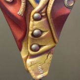
Yellow can be a challenging colour to paint but the addition of other colours from the palette has added interest and variety. The purple was difficult to incorporate into the shadows without creating a psychedelic effect but I overcame this with the addition of Bugman’s Glow and Dark Flesh in the mix and as separate glaze layers.
Base Colour:
 |
| Mournfang Brown & Iyaden Darksun mix |
Shadows:
|
| Mournfang Brown |
|
| Xereus Purple |
|
| Bugman’s Glow |
Mid-tones:
 |
| Iyaden Darksun |
|
| Bugman’s Glow |
|
| Dark Flesh (VMC) |
Highlights:
|
| Dark Flesh (VMC) |
|
| Ivory (VMC) |
Ringmasters Coat.
I expected the coat to be tricky! Red can be a notoriously difficult colour to highlight but things went surprisingly well. This was partly the result of making sure that the highlights stayed in the orange part of the spectrum and avoided pink tones. But for the most part the red went well because I started off with a base colour in the lighter mid-tone range and most of the painting involved adding in the deeper tones and shadows. Working from light to dark really helped me to get the sort of red I wanted, and avoided any problems with chalky highlights.
Base Colour:
 |
| Merchrite Red + Xereus Purple + Evil Sunz Scarlet mix |
Shadows:
|
| Base colour |
|
| Xereus Purple |
|
| Rhinox Hide |
Mid-tones:
|
| Base colour |
|
| Evil Sunz Scarlet |
Highlights:
 |
| Wildrider Red |
|
| Dark Flesh (VMC) |
Hat

The hat has been painted using a combination of stippling and glazes. It was painted, for the most part, from light to dark.
Base Colour:
|
| Rakarth Flesh |
Shadows:
|
| Xereus Purple |
|
| Mournfang Brown |
 |
| Dark Sea Blue (VMC) |
Mid-tones:
|
| Mournfang Brown |
|
| Baneblade Brown |
 |
| Seraphim Sepia |
Highlights:
|
| Seraphim Sepia |
|
| Ivory (VMC) |
The hat band was painted with Sotek Green. It was shaded with Xereus Purple and Dark Sea Blue (VMC) and highlighted with a Sotek Green and Ice Blue mix. Ivory (VMC) was added for the final highlights.
 |
| Sotek Green |
|
| Xereus Purple |
|
| Dark Sea Blue (VMC) |
|
| Ice Blue |
|
| Ivory (VMC) |
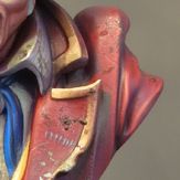
Deep Shadows
In a few areas I needed a very deep shadow colour. This was achieved by using a combination of Dark Sea Blue (VMC) and Rhinox Hide. These were used on their own and in combination with each other and the area’s predominant colour.
 |
| Rhinox Hide |
|
| Dark Sea Blue (VMC) |
Great post. Trying to incorporate continuity and contrast is something that I struggle with. It reinforces everything I have learned to see you keep the purple in the mix from one section to another. Do you have any tips for keeping the "key colors" from taking over? I have to try out your brown grey with purple right now!
ReplyDeleteTo stop the key colours from taking over I usually restrict their use in a pure form to the absolute minimum. They are nearly always mixed with other colours from the palette. That way they can give unity to the colour sheme without dominating it. They are present in almost all areas but it is in a subtle way.
ReplyDeleteI've enjoyed this (and earlier tutorials) but wanted to thank you for detailing the paints used - this is something that so many tutorials neglect.
ReplyDeleteRegards
Tony